Of the 32 teams in the NFL, you probably have a favorite. If I had to guess, a majority of people who read this would be Green Bay Packer fans. Wisconsin is lucky to have the Packers, and the fans are lucky the Packers have such good uniforms.
Unfortunately some teams aren’t as blessed. There are some uniforms still worn today that are just bad. Of course everybody is welcome to their own opinions, but these are just some of the worst and how they might be changed.
To start off easy I’ll poin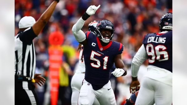 t out the Texans. The youngest franchise in the league and also the least developed uniform-wise. Their only unique wardrobe piece is their battle-red helmets introduced in 2022. They have worn the same navy, white and red alternate jerseys for 20 years now. The uniforms aren’t horrible, but they are becoming dull and don’t represent the team’s identity. The Texans have been, historically or statistically, a bad franchise for most of their lifespan. But with new life with CJ Stroud and Demeco Ryan leading the ship, it’s time to revamp the Texans aesthetic. As far as improving the uniforms they need to work more red and white into the navy base. A lot of teams use navy or dark blues in their jerseys, but Texans are the only one that pair it with red. A better combination of the two would help them stand out.
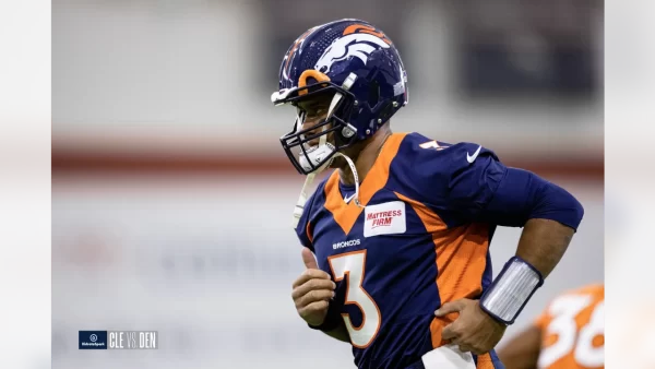 Another offender I’m calling out are then Denver Broncos. Yet another team suffering from its navy. The obnoxious navy “sweat stains” on the jerseys have to go. They make watching them play very unpleasant. The navy helmets as well aren’t doing them any favors. Fixing the Broncos uniforms would include a more modern redesign of either their classic or vintage jerseys, plus a shift back to their old royal blue color. The pairing of orange and royal blue would pop beautifully in games and remain unique compared to so many other teams that use blue.
On a slightly positive note, the Arizona Cardinals had a redesign this past offseason that majorly improved their uniforms but still leaves me wanting. The overdesigned and old uniforms were a modern eyesore with their dull colors and 2000s era design. They did the right thing changing them. However the redesign despite all its improvements doesn’t contain enough personality. The solid colors are simply boring. The solid colors are clean, but they don’t encapsulate enough personality of a 100+ year old franchise. They need to implement more personality into the jerseys.
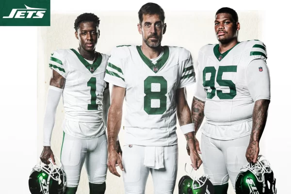 The New York Jets. To put it simply, disgusting. Their old uniforms were perfect. They had personality and style. Their updated uniforms make me want to vomit. The puke green is so unflattering, and the uncomfortable shine of the helmets is horrendous. The only positive note I have is about their new throwback white uniforms. The shade of green compliments the uniforms so well in those, and the helmet logo is amazing. The Jets need to redesign the whole thing, with those throwbacks as the blueprint.
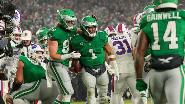
To wrap this up on a positive note, teams have been producing bangers all year with their throwbacks. The Seahawks, Browns, Jets, Buccaneers, Vikings, Titans/Oilers and Eagles all have introduced or brought back incredible throwbacks. That doesn’t even include teams that already have great throwbacks like the Saints, Dolphins, Patriots, Giants, Cowboys, Falcons, 49ers and Steelers. The modern throwbacks are the best subsection of team uniforms and given their success I expect more teams to introduce some form of them next offseason.


